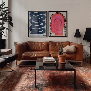
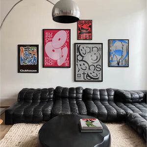
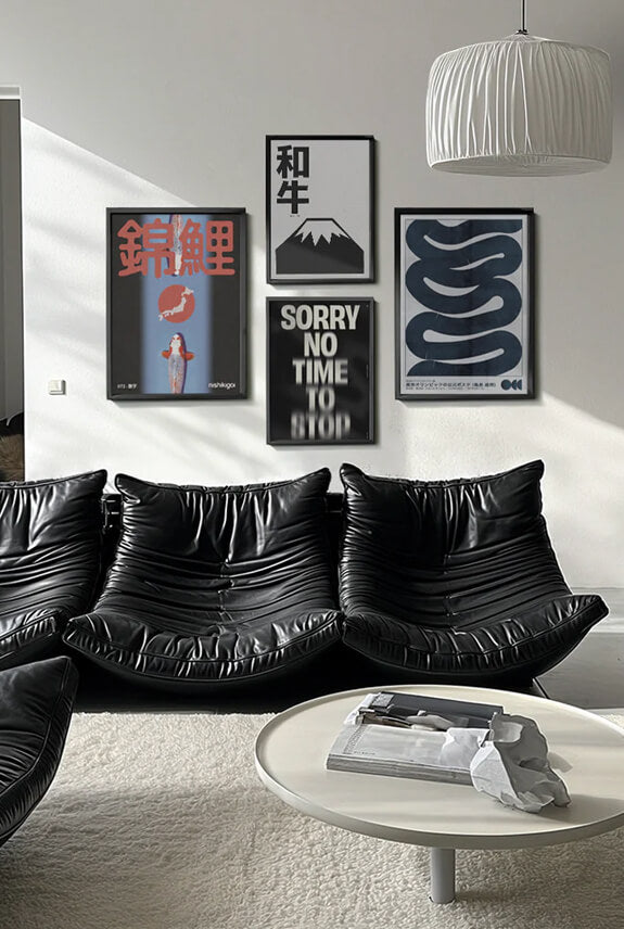
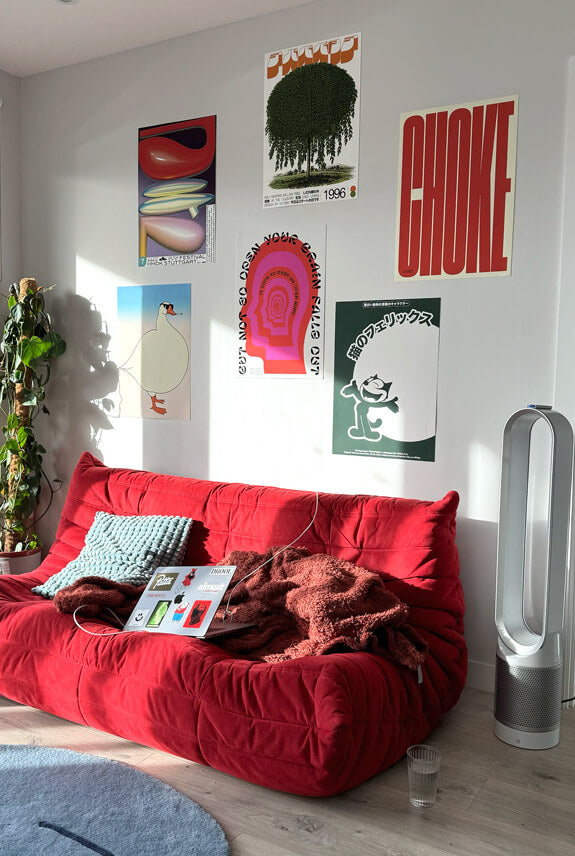
Have you ever thought, how the hell interior designers and artists find the winning colour combos? Well, they use a little thing called colour theory, which is a magical combination that blends art and science to figure out what colours work best together
In this guide we'll break down:
1. Our friend the colour wheel
2. It's all about shades, tints and tones
3. Colour schemes and how to use them
SECTION #1
Our friend the colour wheel
You’ve probably heard of the colour wheel before, but have you ever used it and I mean actually use it?... like put into practise? In 1666, Isaac Newton managing to map the colour spectrum into a circle, which gave birth to the invention of the colour wheel design. Still used today, the colour wheel is utilised in everything from art to interior design and everything in between. It's an incredible useful tool as it’ll show you the relationships between different colours, making it the basis of colour theory

Colour wheel basic's:
Primary colours: red, yellow, and blue
Secondary colours: the output of mixing any two primary colours - green, purple and orange
Tertiary colours: made from mixing a primary colour with a secondary colour to get all the different colours in the colours wheel (yellow green, blue green, blue violet, red violet, red orange, and yellow orange)
SECTION #2
Basic colour theory
Hue: The actual colour you’re referring to, like blue
Value: The lightness or darkness of a colour
Saturation: The intensity of a colour
Tint: Adding white to a colour
Tone: Adding grey to a colour
Shade: Adding black to a colour
SECTION #3
Colour schemes and how to use them
Colour wheel combinations
Complementary colours: Opposite colours on the wheel (eg blue and orange) Using complementary colours secret a bold and sharp contrast

Analogous colours: Side by side on the colour wheel (eg blue and purple). Analogous colours are pleasing to the eye and ‘guides’ the visitor

Monochromatic colours: Focusing on just one colour on the wheel but playing with different shades. Creates a very simple and clean aesthetic

Triadic (advanced): Evenly spaced around the colour wheel (blue, red, yellow). Makes the image pop and makes each colour stand out in a harmonious way

SECTION #4
Colour palettes and how to use them
Warm: these are oranges, reds and yellows (but can also include browns and golds). Warm colours give off a bright and cozy vibe and often evoke passion and energy
Cool: these are blue, greens and purples. Cool colours give off a more relaxed and calming vibe and often evoke professional, cleanliness and calmness
Neutral: these are black, whites and browns. Neutrals on their own can look boring unless done creatively as they give off sophistication and professionalism. But thankfully they can be easily pairing with brighter accent colours
SECTION #5
Colour psychology
It's known that colour can evoke really strong emotions. So here's a breakdown of some of the psychology behind each major colour
Red
Mental reaction: inspires action and confidence Association: fire, energy, strength, power love Mood: intensity, anger, excitement, lust Rooms often used: kitchen, dinning room, living room, playroom
Yellow
Mental reaction: boost communication Association: warmth, joy, friendship, socialisation Mood: friendly, happiness, optimism Rooms often used: kitchen, nursery, workout room, bathroom
Blue
Mental reaction: Calm and aids intuition Association: peace, softness, serenity, water, cool Mood: productive, calm, relaxed, cold Rooms often used: bedroom, office, living room, dinning room, kitchen, nursery, bathroom
Green
Mental reaction: relaxes mentally and physically Association: natural, money, life, growth Mood: calm, happiness, luck, patient Rooms often used: Living room, bedroom, office, dinning room, kitchen, bathroom
Orange
Mental reaction: stimulates apprentice and activity Association: cheerfulness, caution, warmth Mood: impulsiveness, fear, confidence Rooms often used: workout room, living room, office, bathroom
Purple
Mental reaction: uplifts and encourages creativity Association: luxury, fun, loyalty, softness Mood: happiness, playfulness, calming Rooms often used: living room, dinning room, bedroom, craft room, kids room
SECTION #6
Design with colour
The 60-30-10 rule defines that you should design a room by picking three core colours, and then distribute them in those three percentages to keep the palette balanced and harmonious. 60% will be the dominant colour (like a neutral, thought certainly not always!), 30% would be something a bit bolder, and 10% will be the accent colour (often the boldest colour)
Sum it up
When used right, colour theory is very powerful, as it brings much needed logic theory into the mix, helping you to help create balance and cohesion. Which is why you'll find the colour wheel in art, the colour wheel for interior design and even the basis of colour wheel for paint. Delve deeper into interior design and decorating with colour by reading our guide on how to make colourful art prints work in your home


